A new standard for care delivered within the same day.
The repositioning of Kliniké as Millenium Day Hospital marks a new chapter for the institution. The identity was created to convey a more approachable, safe, and contemporary healthcare model—bringing together medical specialties, innovation, and a genuinely human care experience.
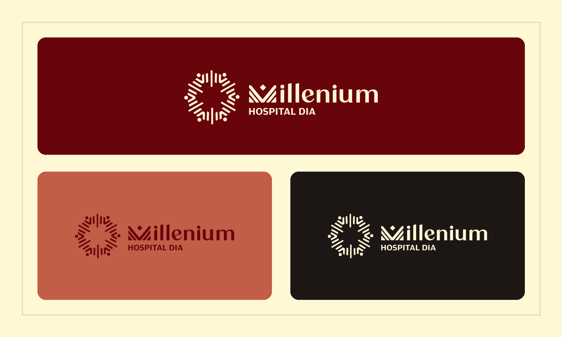
The circular symbol represents the integration of people, services, and care. A burgundy, terracotta, and cream palette creates a warm, sophisticated presence, while the typography balances clarity and personality. The result is a brand ready to position the hospital as a benchmark in health and well-being.