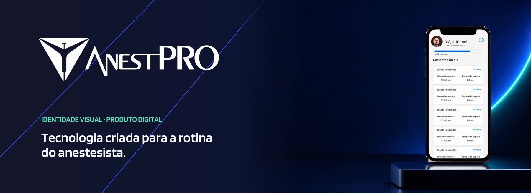
Technology designed for the anesthesiologist’s daily practice.
AnestPro was born from the need to make clinical management more practical for professionals working in a high-responsibility environment. The brand positions the product as a specialized tool: precise in its communication, simple in what it delivers, and available whenever information needs to be within reach.
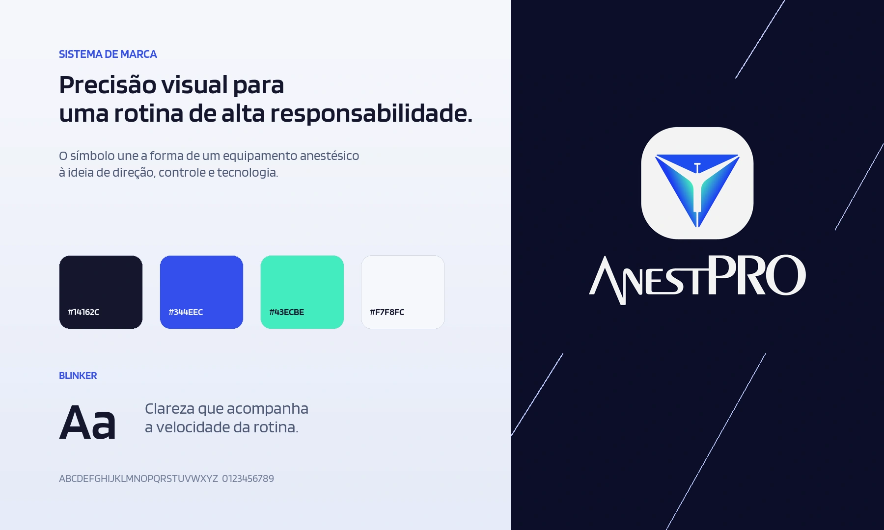
The symbol combines references from anesthesiology with a geometric construction featuring a strong vertical direction. Deep blue conveys trust and stability, while electric blue and the blue-to-green gradient add technology, movement, and distinction to the system.
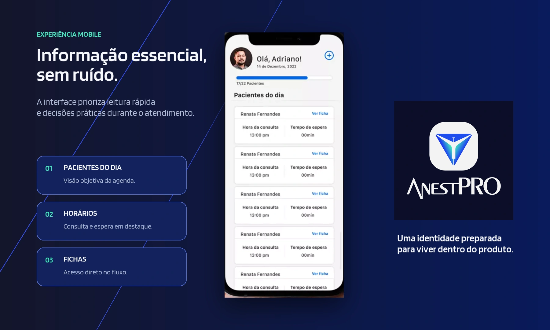
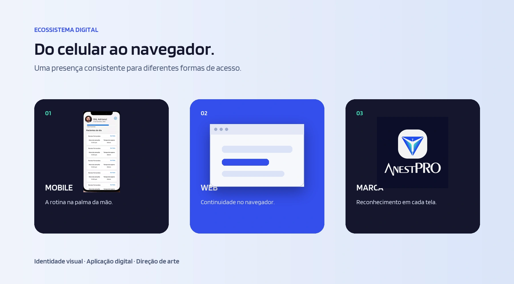
In the digital product, the identity supports an interface organized around patients, schedules, and access to medical records. The result is a visual system designed to move seamlessly from mobile devices to the browser without losing clarity, consistency, or personality.