Design that expresses life, trust, and a new beginning.
The project began with the need to reposition the brand after an important professional transition. With a practice focused on neonatology and intensive care for newborns, the identity needed to communicate technical expertise without losing the sensitivity associated with pediatric care.
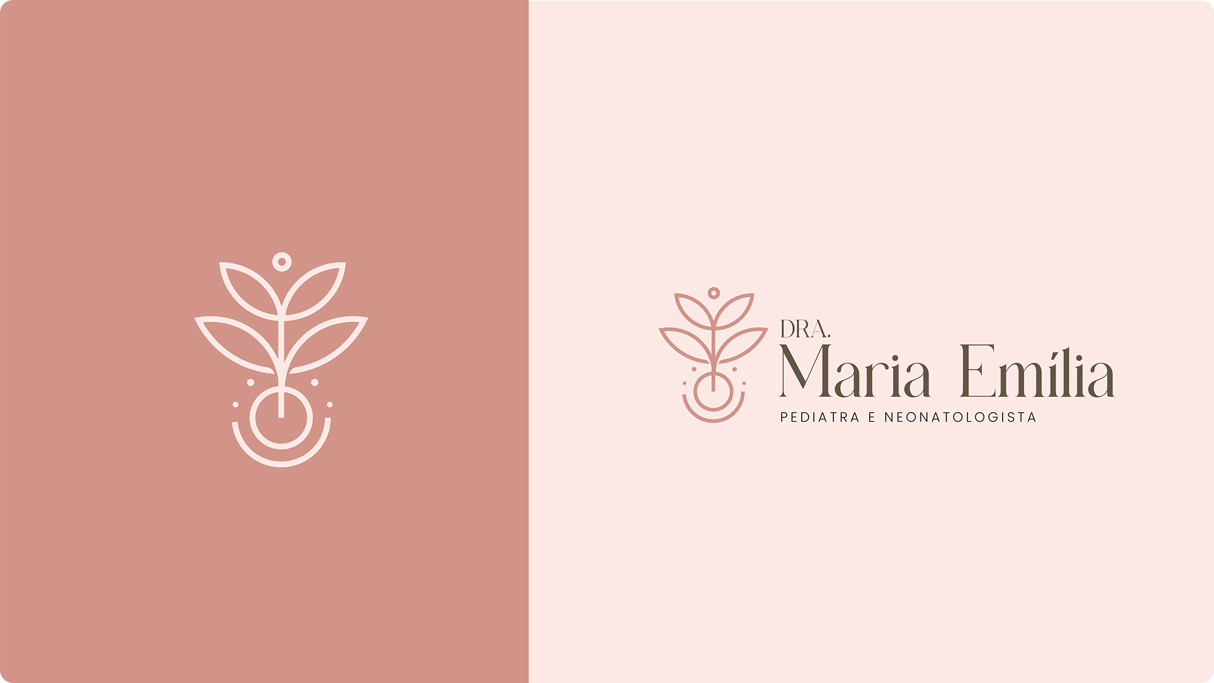
The work included logo development, visual concept, a soft color palette, and elegant typography. The tree symbol represents birth, growth, and renewal, while its composition subtly recalls the letter “M,” creating a sophisticated, memorable identity aligned with the physician’s positioning.